

 PIPAVO Team
Learn how to read candlestick charts, understand basic patterns, and choose the right Forex timeframe for your trading style.
In this article
Candlestick charts help Forex traders understand price movement by showing the open, high, low, and close of each trading period. Choosing the right timeframe helps you match your chart analysis with your trading style, risk tolerance, and decision speed.
This guide explains how to read candlestick charts, what common candle signals may suggest, and how to choose a timeframe without relying on guesswork.
What Is a Candlestick Chart?
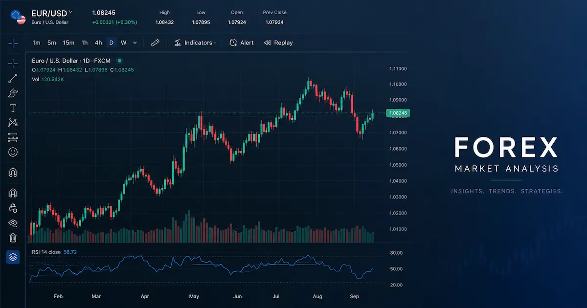
A candlestick chart is a type of price chart that displays market movement over a selected period of time. Each candle represents one period, such as 1 minute, 15 minutes, 1 hour, 1 day, or 1 week.
To create a candlestick chart, price data usually includes four key values: open, high, low, and close, often called OHLC data. The candle body and wick show these values visually, making price action easier to read than a simple line chart.

The Four Parts of a Candle
A single candlestick includes:
- Open: The price at the start of the selected period
- Close: The price at the end of the selected period
- High: The highest price reached during the period
- Low: The lowest price reached during the period
If the close is higher than the open, the candle is usually shown as bullish. If the close is lower than the open, the candle is usually shown as bearish. Colors vary by platform, but green or white often means bullish, while red or black often means bearish.
How to Read Candlestick Charts
Reading candlestick charts is not about memorizing shapes alone. It is about understanding what price is doing, where buyers or sellers may be active, and whether the market is trending, slowing, or consolidating.
1. Look at the Candle Body
The body shows the distance between the open and close.
A large body suggests stronger movement during that period. A large bullish body may show buyer pressure, while a large bearish body may show seller pressure.
A small body suggests indecision or limited movement. This can happen before a breakout, during low liquidity, or near important support and resistance areas.
2. Study the Wicks
The wick, also called the shadow, shows how far price moved beyond the body before pulling back.
A long upper wick may suggest that buyers pushed price higher, but sellers rejected that move before the candle closed.
A long lower wick may suggest that sellers pushed price lower, but buyers stepped in before the candle closed.
Wicks are especially useful around key price levels because they may show rejection, hesitation, or failed breakouts.

3. Compare Candles in Context
One candle alone rarely gives enough information. A candle becomes more useful when compared with the candles before and after it.
For example, a bullish candle after a strong downtrend may mean something different from a bullish candle inside a sideways market. Before making any trading decision, consider:
- The current trend
- Nearby support and resistance
- Market volatility
- Recent news or economic events
- Whether the candle signal has confirmation
Candlestick patterns can help organize price action, but they should not be treated as guaranteed signals.
Common Candlestick Patterns Beginners Should Know
Candlestick patterns are visual formations that traders use to interpret price behavior. They are not predictions. They are clues that need confirmation from broader market context.
Doji
A doji forms when the open and close are close together. It often suggests indecision because neither buyers nor sellers clearly controlled the candle.
A doji may be more meaningful after a strong trend or near a major support or resistance level. On its own, it is not enough to confirm a reversal.
Hammer
A hammer has a small body and a long lower wick. It may appear after a decline and suggest that sellers pushed price lower but buyers brought it back up before the close.
A hammer is stronger when it appears near support and is followed by bullish confirmation.
Shooting Star
A shooting star has a small body and a long upper wick. It may appear after a rise and suggest that buyers pushed price higher but sellers rejected the move.
This pattern is more relevant near resistance and should be confirmed by later bearish price action.
Engulfing Pattern
An engulfing pattern happens when one candle body fully covers the body of the previous candle.
A bullish engulfing pattern may suggest stronger buyer interest after a decline. A bearish engulfing pattern may suggest stronger seller interest after a rise.
Because Forex markets can move quickly, especially around news releases, traders should avoid relying on a single pattern without risk controls.

What Is a Trading Timeframe?
A trading timeframe is the period represented by each candle on a chart. For example:
- On a 5-minute chart, each candle represents 5 minutes of price movement.
- On a 1-hour chart, each candle represents 1 hour of price movement.
- On a daily chart, each candle represents one trading day.
The timeframe you choose affects how often you trade, how much market noise you see, and how quickly you need to make decisions.
How to Choose the Right Forex Timeframe
The best Forex timeframe depends on your trading style, schedule, experience, and risk tolerance. There is no single “best” timeframe for every trader.
Short-Term Timeframes
Short-term charts include 1-minute, 5-minute, and 15-minute timeframes.
These are often used by scalpers or very active day traders. They show many price movements, but they can also create more noise and false signals.
Short-term timeframes may suit traders who:
- Can monitor charts frequently
- Make quick decisions
- Understand spreads and transaction costs
- Have strict risk management rules
Beginners should be careful with very short timeframes because they can encourage overtrading.
Medium-Term Timeframes
Medium-term charts include 30-minute, 1-hour, and 4-hour timeframes.
These are commonly used by day traders and swing traders. They offer a balance between detail and broader market structure.
Medium-term timeframes may suit traders who:
- Want fewer signals than scalping charts
- Prefer more time to analyze setups
- Use support, resistance, and trend analysis
- Do not want to monitor every price tick
For many beginners, the 1-hour and 4-hour charts can be easier to study than very short-term charts.
Long-Term Timeframes
Long-term charts include daily, weekly, and monthly timeframes.
These are often used by swing traders, position traders, or investors analyzing broader market direction.
Long-term timeframes may suit traders who:
- Prefer slower decision-making
- Want to reduce chart noise
- Hold trades for several days or longer
- Focus on major trends and macroeconomic context
Long-term charts can make trends easier to identify, but trades may require wider stop-loss levels and more patience.

Use Multi-Timeframe Analysis
Multi-timeframe analysis means checking more than one chart timeframe before making a decision. This helps traders avoid focusing too narrowly on one chart.
A simple approach is:
Higher Timeframe: Identify Direction
Use a higher timeframe, such as the daily or 4-hour chart, to understand the broader trend.
Ask:
- Is the market trending up, trending down, or moving sideways?
- Is price near major support or resistance?
- Is the market structure making higher highs or lower lows?
Middle Timeframe: Find the Setup
Use a middle timeframe, such as the 1-hour chart, to look for a potential setup.
Ask:
- Is price pulling back within the trend?
- Is there a candlestick pattern near a key level?
- Is momentum slowing or strengthening?
Lower Timeframe: Refine Entry
Use a lower timeframe, such as the 15-minute chart, to refine timing.
Ask:
- Is there confirmation before entry?
- Where would the trade idea become invalid?
- Is the risk-to-reward ratio reasonable?

Candlestick Charts and Risk Management
Candlestick charts can help traders read price action, but they do not remove risk. Forex trading can involve leverage, and leverage can magnify both gains and losses. Retail Forex traders should understand margin, spreads, volatility, and the possibility of losing capital before trading.
Technical analysis also does not guarantee future results. Past price behavior may provide context, but it does not ensure that the same outcome will happen again. The SEC notes that past performance does not necessarily predict future results.
Before using candlestick charts in live trading, consider:
- Testing your approach on historical charts
- Practicing with a demo account
- Using stop-loss orders where appropriate
- Risking only a small percentage of capital per trade
- Avoiding emotional decisions after losses or wins
- Reviewing your trades in a journal
Common Mistakes to Avoid
Mistake 1: Reading Candles Without Context
A hammer, doji, or engulfing pattern means very little without trend, support, resistance, and volatility context.
Mistake 2: Using Too Many Timeframes
Checking too many charts can create confusion. Beginners may start with two or three timeframes instead of jumping between every available option.
Mistake 3: Trading Every Pattern
Not every candlestick pattern is worth trading. Quality matters more than quantity.
Mistake 4: Ignoring News Events
Forex markets can move sharply around central bank decisions, inflation data, employment reports, and geopolitical events. A clean technical setup can fail during high-impact news.
Mistake 5: Choosing a Timeframe That Does Not Match Your Lifestyle
A 5-minute chart may not be practical if you cannot monitor the market closely. A daily chart may be more suitable for traders who prefer slower decisions.
Frequently Asked Questions
There is no single best timeframe. Short-term traders may prefer 5-minute or 15-minute charts, while swing traders may prefer 4-hour or daily charts. The right timeframe depends on your strategy, schedule, and risk tolerance.
Candlestick patterns can be useful, but they are not always reliable on their own. They work best when combined with trend analysis, support and resistance, market context, and risk management.
Beginners can start with simple patterns such as doji, hammer, shooting star, and engulfing patterns. These are easier to understand and commonly used in price action analysis.
A daily chart usually has less noise and gives a broader view of the market. A 5-minute chart gives more detail but can produce more false signals. Beginners often find higher timeframes easier to analyze.
Candlestick charts do not predict the market with certainty. They help traders interpret price action and possible buyer or seller behavior, but outcomes are never guaranteed.
Conclusion
Candlestick charts are a practical way to read Forex price action because they show the open, high, low, and close in a visual format. To use them well, focus on candle structure, market context, and confirmation instead of memorizing patterns in isolation.
Choosing the right timeframe is just as important. Match your timeframe to your trading style, available time, and risk tolerance. Start simple, use multi-timeframe analysis, and build a trading process that prioritizes consistency over speed.
CTA: Continue learning by studying support and resistance, risk management, and basic technical analysis before applying candlestick strategies in live market conditions.
Risk Disclaimer
This article is for educational purposes only and does not provide financial, investment, or trading advice. Forex trading involves substantial risk and may not be suitable for all traders. Leverage can magnify losses as well as gains. Past performance and historical chart patterns do not guarantee future results. Always conduct your own research and consider consulting a qualified financial professional before making trading decisions.
Claims / Stats That Need Credible Sources
- Any statement about the percentage of traders who lose money
- Any claim that a specific candlestick pattern has a fixed win rate
- Any claim that one timeframe is statistically “best” for Forex trading
- Any broker-specific leverage, margin, spread, or execution claim
- Any performance comparison between trading strategies